You may be a writer by profession, but when deciding on your book covers, you need to think like a reader and a marketer.
Have you ever stopped and asked yourself, “When was the last time I was really mesmerized and drawn in by a book cover?” Many of us remember the times it almost felt magical walking into a bookstore or library and a book catching our eyes. Instantly feeling the butterflies in our stomach, we picked it up, read around in and stroked our hand over its matte soft cover. We knew it was The One.
That rush we feel whenever a book cover entrances us, that’s real emotion. “When a reader sees your book cover, they should feel something. They should feel curious, inspired, thrilled, hopeful, or worried. Emotion is what makes a reader pick up a book. Every piece of your cover should work to create an emotion,” wrote Caitlin Berve in her August 2018 blog for Ignited Ink Writing.
Must all these emotions happen even before you open the book’s pages and read it? Yes. In many ways, it’s like love at first sight. When we glance at a book for the first time, it’s its cover that we notice. The cover – and everything on it – is a shortcut that should tell the reader in gist three things: (1) that they’ll like the content; (2) that it’s in their favorite genre; and (3) that the author is someone they can trust to be in charge of their reading experience.
Here’s another important point: You gotta win over a reader, who’s going to invest in your book, with a great visual and emotional experience that draws them in. Your hardwork doesn’t end after the writing ceases. In short, you ought to consider the book cover and blurb as parts of your marketing campaign, as sales tools.
Yet, you can never pull it off alone. Hire the best book designer you can afford if you lack the artistic skills to bring your vision to life. Consult with friends in the same profession. More importantly, take it from essayist and cartoonist Tim Kreider when he wrote in a July 2013 New Yorker article: “I had what we’ll call a constructive dialogue with my publisher’s editorial, design, and marketing teams, finding a balance between my personal vision and something people might possibly want to buy. For months we went back and forth: I’d send them several illustration options and they’d pick whichever one I liked least; they’d send me some design options, I’d pick the one that made me least unhappy, and they’d veto it.”
Following the main principles of visual design in any product – books, cars, clothes, houses, etc. – don’t forget that it must be fearless, eye-catching and noticeably unique from everyone else’s. But hey…not too much! The more important a book is, the less likely there is to be anything at all on its cover, observed Kreider in the same article. “Look at most editions of Ulysses. Even the ancient equivalents of summer blockbusters like Homer and Beowulf or the sex romps and gorefests of Shakespeare tend to get stodgy public-domain paintings on their covers,” he wrote.
This simplicity in design, particularly the single-object-on-white-background template, was so successfully executed in Malcolm Gladwell’s 2000 hit The Tipping Point that his ensuing works have relied on the same formula. Likewise, many designers have used Gladwell’s minimalist design as inspiration for their book covers, spawning a competition of sorts to see who can do more with less. The one that comes to mind is Timur Vermes’ Look Who’s Back, published in 2012. Designed by German illustrator Johannes Wiebel, the cover doesn’t have a lot of details except the combover and a moustache (doubling as title of the book) – a clever way to depict an image of Adolf Hitler, who is the subject of the story.
Emotion in colors
Your book’s color scheme also communicates to the readers. What are each color telling without you realizing? In general, darker colors evoke seriousness and calm, while ‘hotter’ colors like reds and yellows give off energy, passion and happiness. Pastel colors promote a lighter touch, while more daring colors suggest swag and intensity.
Graphics and typography
Images are more than just decoration. Make them act like teasers to your design rather than spoilers. You’ll know it is well-thought if the images tell a lot about the book without revealing every detail. On the same note, remember that the typography you choose for your book’s title and author’s name can grow into a huge brand. Just like an image, a properly used typography may evoke different feelings and create a mood to enhance your book’s branding.
Illustrations
Should you go for illustrated covers, keep in mind that you’re sending a message of care and thoughtfulness to your readers. You’re drawing an image rather than using and customizing a photo. Utilizing illustrations offers a number of advantages: uniqueness, focus on details, impression, and inspiration.
What are your favorite book covers and why? Let us know on the comments below. Meanwhile, here are top 3+1 best covers of books published by Stampa for inspiration. Enjoy!
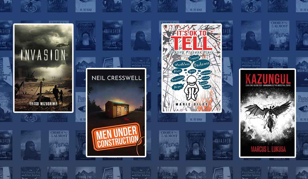
Stampa’s Top 3+1 Cover Design Inspiration

#1 Invasion by Tatsu Mizushima
Great monochromatic color scheme. The typography blends with the light in the sky on the front cover. No doubt, it is the main effect and visuals support it well.

#2 It’s Ok To Tell by Marie Giles
Riveting illustration and interesting use of thought bubbles and speech balloons to convey external negative vibes that can surround a person. The use of color red for the title suggests the intensity of the book’s content.

#3 Men Under Construction by Neil Cresswell
A really great atmosphere for cover. A lone house on top of a hill makes the reader curious to know its significance in the story. Another simple font being used that blends well with the visuals.

Honorable Mention: Kazungul by Marcus L. Lukusa
This one is certainly a mood maker. Its color scheme, font and specific imagery convey a sense of ferocity about the story within. Covers for the Kazungul series were collaborations among the author, Stampa Global, and South African artist Sharon Teeling.